
Decorative candles are more than just sources of light—they are sculptural objects that interact with space, color, and form. Design, color, and composition are essential to creating visually appealing candles that enhance interiors, convey mood, and express artistic intent. By considering these elements thoughtfully, candle makers can produce pieces that feel balanced, intentional, and aesthetically striking.
This guide explores principles and techniques for working with design, color, and composition in candle-making.
Principles of Candle Design
Candle design involves shaping wax, selecting vessels, and arranging decorative elements to create harmony and focus. Every decision affects the visual impact and functional success of the candle.
Form and Shape
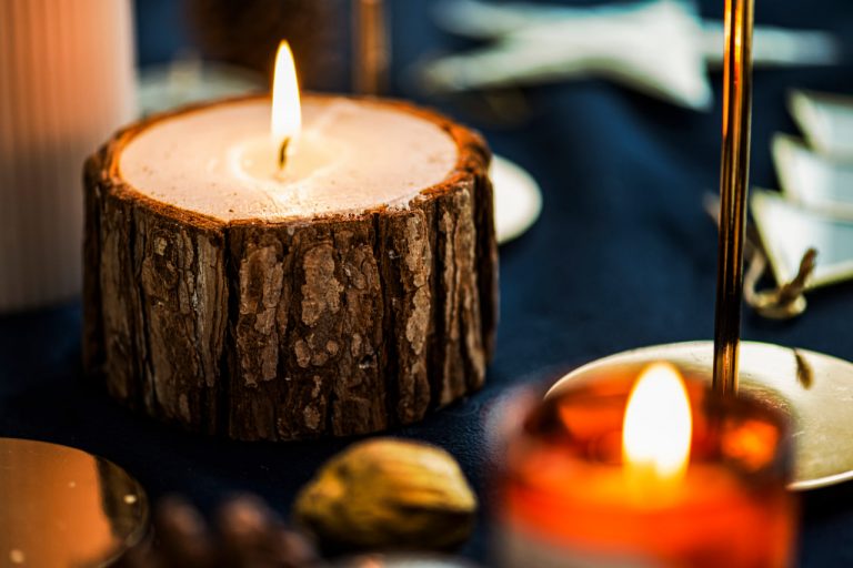
Candle shape influences perception, burning behavior, and overall aesthetics. Cylindrical and tapered candles offer classic symmetry, while square or irregular forms create a modern or sculptural effect. The design should complement the space in which the candle will be displayed.
Scale and Proportion
Proportion relates to the relationship between candle height, width, and decorative elements. Well-proportioned candles feel intentional and balanced, while disproportionate elements can appear awkward or unstable.
Symmetry and Asymmetry
Symmetry conveys order and elegance, while asymmetry introduces movement, interest, and creativity. Thoughtful asymmetry can create visual tension that draws attention without sacrificing stability or harmony.
Using Color Effectively
Color is a powerful tool in candle design, influencing mood, perception, and visual cohesion. Choosing and combining colors intentionally ensures the candle communicates its intended atmosphere.
Color Harmony
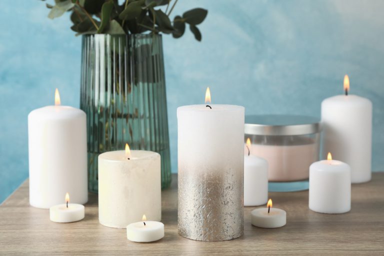
Complementary, analogous, or monochromatic color schemes create a sense of unity and balance. Matching wax, petals, and containers to a consistent palette enhances overall cohesion.
Contrast and Accents
Contrasting colors highlight focal points and guide the viewer’s eye. A single bright or saturated color among softer tones can draw attention to key decorative elements, such as embedded petals or layered sections.
Transparency and Opacity
Wax transparency affects how color interacts with light and embedded materials. Translucent wax allows depth and layering to show through, while opaque wax provides solid, uniform surfaces. Combining both approaches can produce visual richness.
Composition Techniques
Composition is about arranging decorative elements and structural features to create visual balance and interest. Successful composition ensures that every element contributes to the overall effect.
Focal Points
Establishing a visual center directs attention and creates a sense of hierarchy. Focal points can be a vibrant petal, a sculptural wax layer, or an unusual container shape.
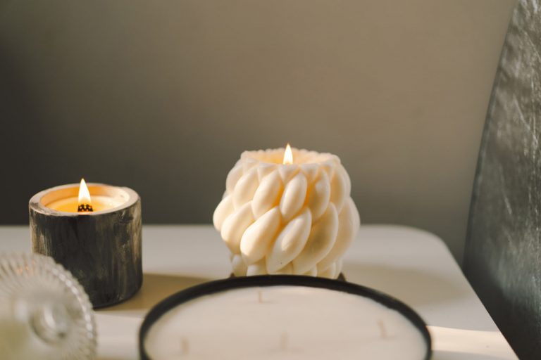
Repetition and Rhythm
Repeated elements, such as layered petals or textured wax patterns, create rhythm and continuity. Repetition connects separate parts of the design, giving it a cohesive flow.
Negative Space
Spaces without decoration are as important as filled areas. Negative space allows light to interact with the candle, emphasizes form, and prevents the design from feeling cluttered.
Layering and Depth
Layering petals, colors, or textures produces a sense of depth and dimension. Strategic layering allows elements to appear suspended or emerging, enhancing the sculptural quality of the candle.
Integrating Vessel and Wax Design
The container or mold plays a key role in overall composition. Glass, ceramic, or metal vessels add their own visual texture and color, influencing how the wax and decorative elements are perceived.
Contrast Between Wax and Vessel
Consider whether the candle wax should blend with or contrast against the vessel. A subtle contrast can create elegance, while a strong contrast draws attention.
Surface Interaction
The texture of the vessel—smooth, frosted, or patterned—interacts with embedded petals or wax patterns, enhancing visual interest. Matching or complementing textures creates cohesion, while deliberate contrast adds drama.
Lighting and Visual Effects
Design, color, and composition influence how a candle interacts with light. The way a candle glows, casts shadows, or refracts through translucent layers can enhance or undermine the intended effect.
Glow and Transparency
Light passing through translucent wax highlights embedded petals and layers. Consider how layering and color intensity affect illumination.
Shadow and Depth
Surface patterns, petals, and sculptural forms cast shadows that contribute to depth and mood. Adjusting placement and thickness ensures shadows enhance rather than obscure the design.
Balancing Aesthetics and Function
While aesthetics are critical, functionality should not be overlooked. The wick, burn rate, and wax stability must be compatible with design choices. Embellishments should not interfere with safe burning or candle longevity.
Successful candle design balances visual appeal with practical considerations, creating pieces that are both beautiful and usable.
Developing a Personal Style
Through practice, candle makers develop a personal approach to design, color, and composition. Experimenting with combinations, layering techniques, and decorative elements builds an intuitive understanding of what works visually and structurally.
Over time, this personal style emerges in signature color palettes, preferred arrangements, and distinctive forms, allowing each candle to reflect both artistic vision and technical skill.